REBRANDING for GROWTH and EXTENDING the MROO BRAND
COMPETENCIES: INSIGHT GATHERING | PROJECT SCOPING | BUSINESS ANALYSIS | CREATIVE BRIEF | USER AND MARKET RESEARCH
The Municipal Retirees Organization Ontario (MROO) asked Colourphill to rebrand the organization with a strong voice that retained a friendly, grassroots feeling.
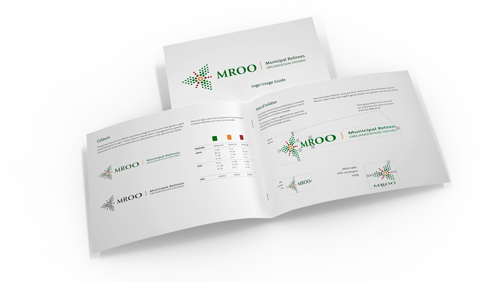
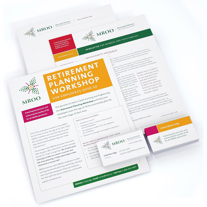
We divided the project into four stages (project brief, creative development, production design and management), which allowed for a measured roll out of the new brand. In the project brief, we learned that, as part of a larger initiative to grow membership, the new visual brand and its implementation had to appeal to MROO members as well as to governments, professional organizations and the media, and achieve a balance between formal and informal. We also learned that an identity guideline was in order because many hands would be using the new identity.
The video was developed to help MROO grow their membership base. The Board of Directors asked Colourphill to help MROO’s presenters, all of them volunteers, tell potential members a compelling story to explain how MROO protects the pensions and enhances the quality of life of all OMERS pensioners.
Having recently helped the organization through a rebranding process, we were intimately familiar with the brand and saw an opportunity to extend the brand into a visual story. Rather than using actors or interviewing existing members, we conveyed a story of ‘growth’ using the recently implemented trillium logo. The new logo, which consisted of dots, was animated into various shapes – from a map to flowers and butterflies; trees and birds; sunshine and clouds. Each segment told a story in an friendly, entertaining and illustrative way.
Original Logo
Redesigned Logo